


Yesterday, while preparing the Thinking Man Book Club post for the novel Dune, John and I had to create a cover image for the post. Naturally.
I like to have fun with these, so I immediately got to work, gathering all the images I needed to badly edit our logo onto a book cover of Dune.
It didn’t take long before John came over and asked me what the hell I was doing.
This was the cover that I initially wanted to use:
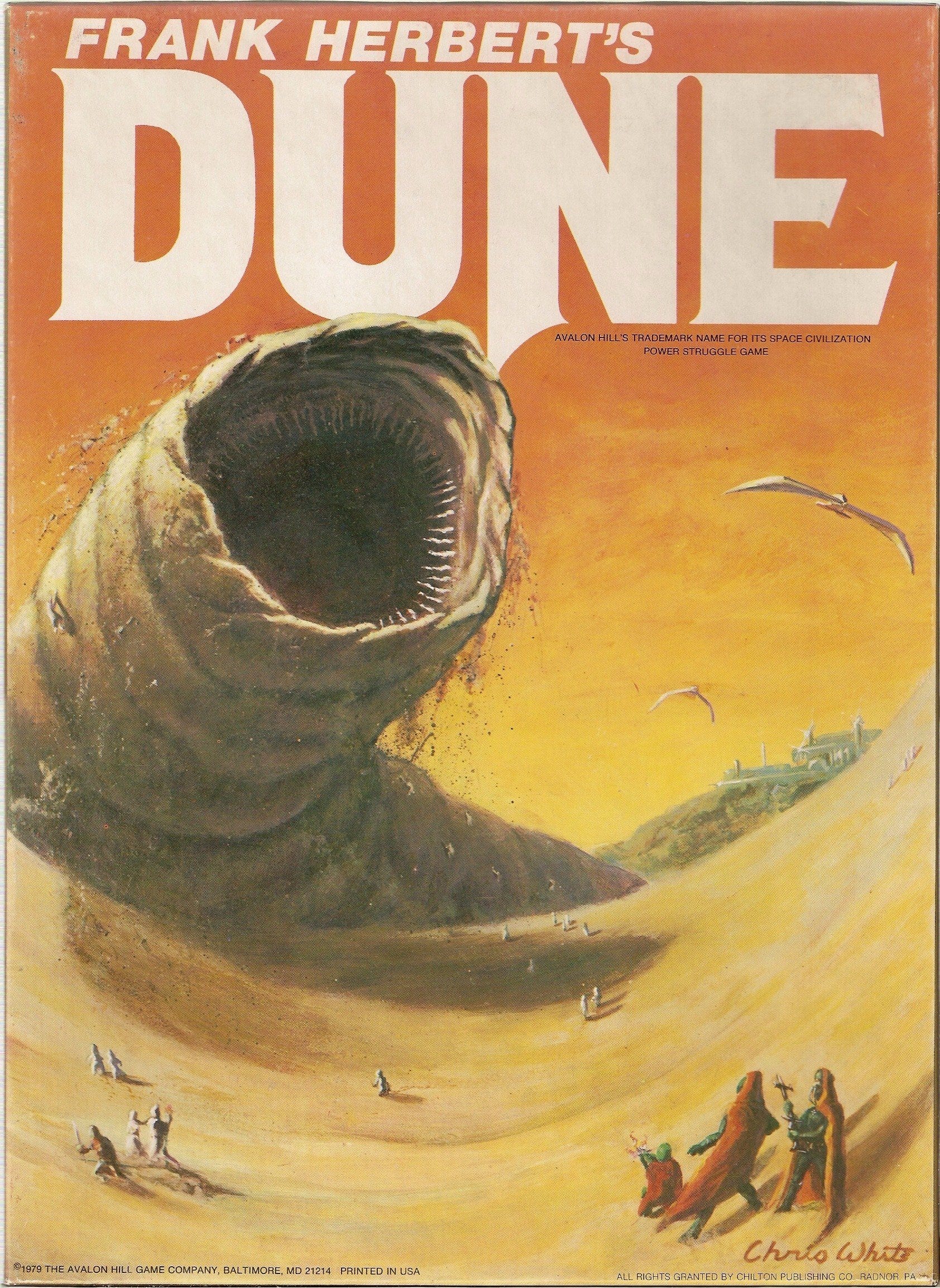
Come on. You have to admit, it’s a cool cover. Well, it would’ve been. It’s actually not a cover of the book, but of a 1979 board game based on it. Yeah, John was probably right that it was a poor choice.
Regardless, I think it’s a really fun picture, and it’s a more interesting thing to have on the cover of a novel than this monstrosity:
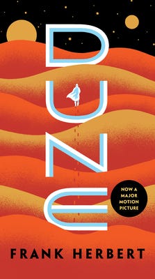
How boring? There’s nothing wrong with it, per se, besides being a near-perfect example of the garish, brightly-colored, cartoony images that are plaguing science fiction book covers one classic at a time.
Compare it with the original:
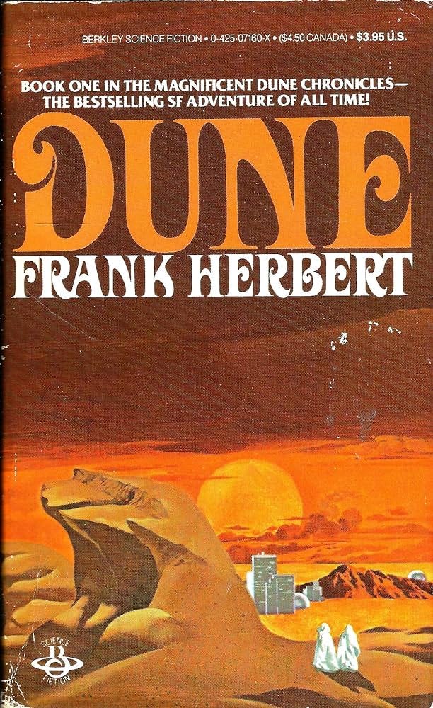
The new one is soulless. This one has charm! (At only $3.95 USD, no less.)
Why do publishers think that consumers want to buy these lazy, uninspired images that could’ve been drawn by robots?
One possibility is that they were drawn by robots (or they want to get us used to that style before making the switch), but the more likely one is that this new book cover ‘trend’ perfectly mirrors the overarching values of our ‘modern’ society. Cheap, lazy, eye-catching, easily digestible products.
Dune is actually one of the lesser victims. The cover’s not that bad, albeit a little flat, and it’s not like the original one was winning any design awards.
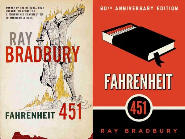
Look what they did to Farhrenheit 451. This was one of the best book covers of all time:

Now, your average Barnes & Noble shopper is stuck with this:

It’s disgraceful. This is arguably the worst book cover ‘makeover’ of all time.
Of course, it could always be worse. At least they bothered to slap a picture on it. Philip K. Dick’s books all look like this:

I don’t get it. Maybe these books sell anyway, so it’s not worth the publisher’s time (and money) to hire a decent artist?
It’s not like any of these ‘minimalist’ covers are grotesque. They’re just, well, meh. They don’t look like much of anything. They’re not so much an eyesore as they are a cheap stand-in for a cover that could’ve been so much better.
It’s the opportunity cost that bugs me. These covers could be cool. Instead they’re just, well, there.
Do people just not value original, creative images anymore?
Even worse—do people think these things actually look good?
Ah, the lost art of book covers! They’re supposed to stimulate the reader’s imagination, give a sense of what’s inside. I’m working on some potential book covers myself for my debut volume of poetry, and I’ve gotta say it has to grab the reader’s attention. As in “this is not just gonna be your garden variety book of poetry.”
Goosebumps books also got this unfortunate treatment. I have to admit though, I kind of prefer the new Dune cover…